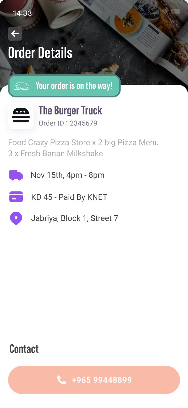



The Pet Truck
Ordered on Nov 20th 12:00 AM
 Your Truck is on the way!
 Case study · Mobile app

Truckit’s visual identity no longer reflected its evolving goals or the diversity of its service offerings. A complete rebrand was necessary to better represent the brand.
With service trucks spanning a wide range of industries including food, beauty, pet grooming and more, the app lacked a clear categorization system. Users faced difficulties locating their desired services efficiently.
Users had no effective way to compare businesses within the same field. Without tools to evaluate pricing, special offerings, or service quality side by side, they struggled to make informed decisions, often abandoning the app mid search.
Every Vitruvian project starts by understanding the people it serves. For Truckit, we used 3 of our methods:
Conducted a competitive analysis of mobile booking platforms across various industries. The main goal was to identify common UI/UX patterns and study different navigation models for multi-category services.
Created low fidelity wireframes to test service categorization layouts in terms of improving discoverability and encouraging bookings.
Developed interactive prototypes that simulated the full user journey from browsing categorized services to viewing business details and completing a booking.
Developed a refreshed visual identity for Truckit, including an updated logo design, color variations, and typography. New brand guidelines were introduced to establish a more cohesive and professional presence across all touchpoints.
To address the confusion caused by the app’s unstructured layout, a clear categorization system was introduced. Services were grouped under easily identifiable categories such as Food Trucks, Beauty Services, and Pet Grooming, allowing users to browse by interest or need. Each category featured a curated list of businesses with preview cards showing basic information like pricing, availability, and ratings. This organization not only improved navigation but also encouraged discovery by helping users explore services they might not have searched for directly. Filters and sorting options were also added within each category to narrow results based on preferences like location, service type, or popularity.
A review system was added to give users insight into each business through real customer feedback. Ratings and written reviews highlighted service quality, and overall satisfaction, helping users compare options with greater confidence.
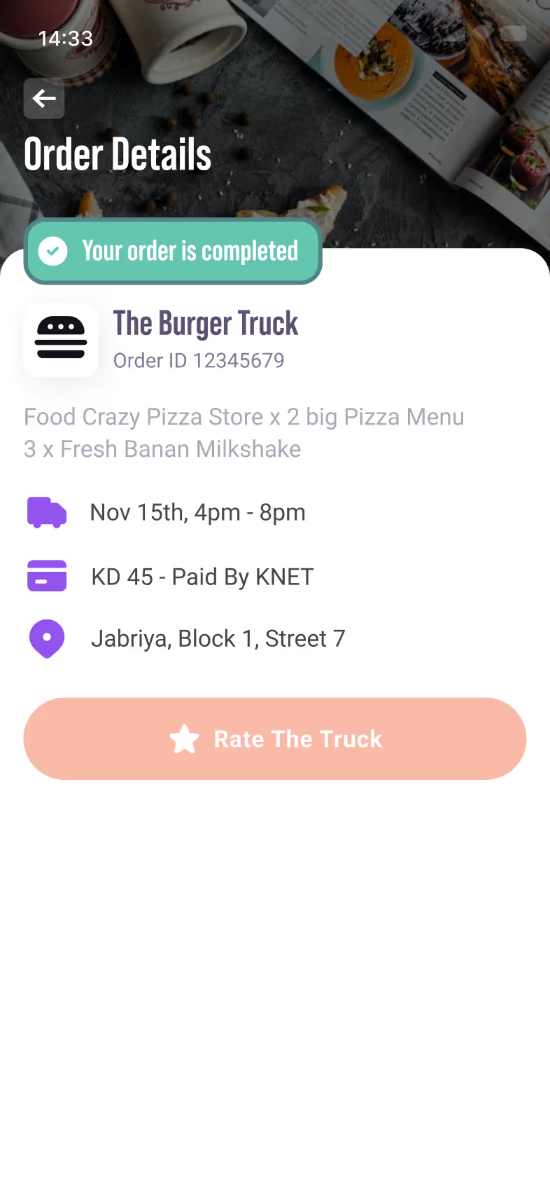
The new homescreen was designed to give users immediate access to the status of their ongoing orders. Real time updates inform users of each stage in the process, from confirmation to completion, eliminating the need to navigate away from the main screen. A section dedicated to past orders allows users to quickly review their booking history. To make rebooking effortless, a re-order option was added to each previous order, enabling users to repeat a service with just one tap.

















 Nov 15th, 4pm - 8pm
 Jabriya, Block 1, Street 7








 KD 45 - Paid By KNET