Users struggled to locate suitable venues due to the lack of clear categorization by sport type, location, or facility features. The absence of filters and intuitive navigation made it time consuming to browse options leading to user frustration.
Disorganized Information Display
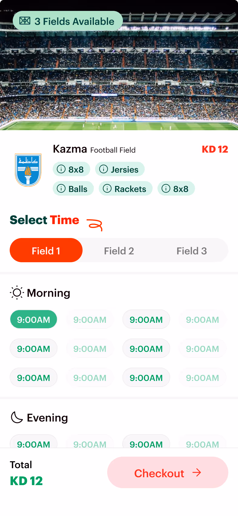
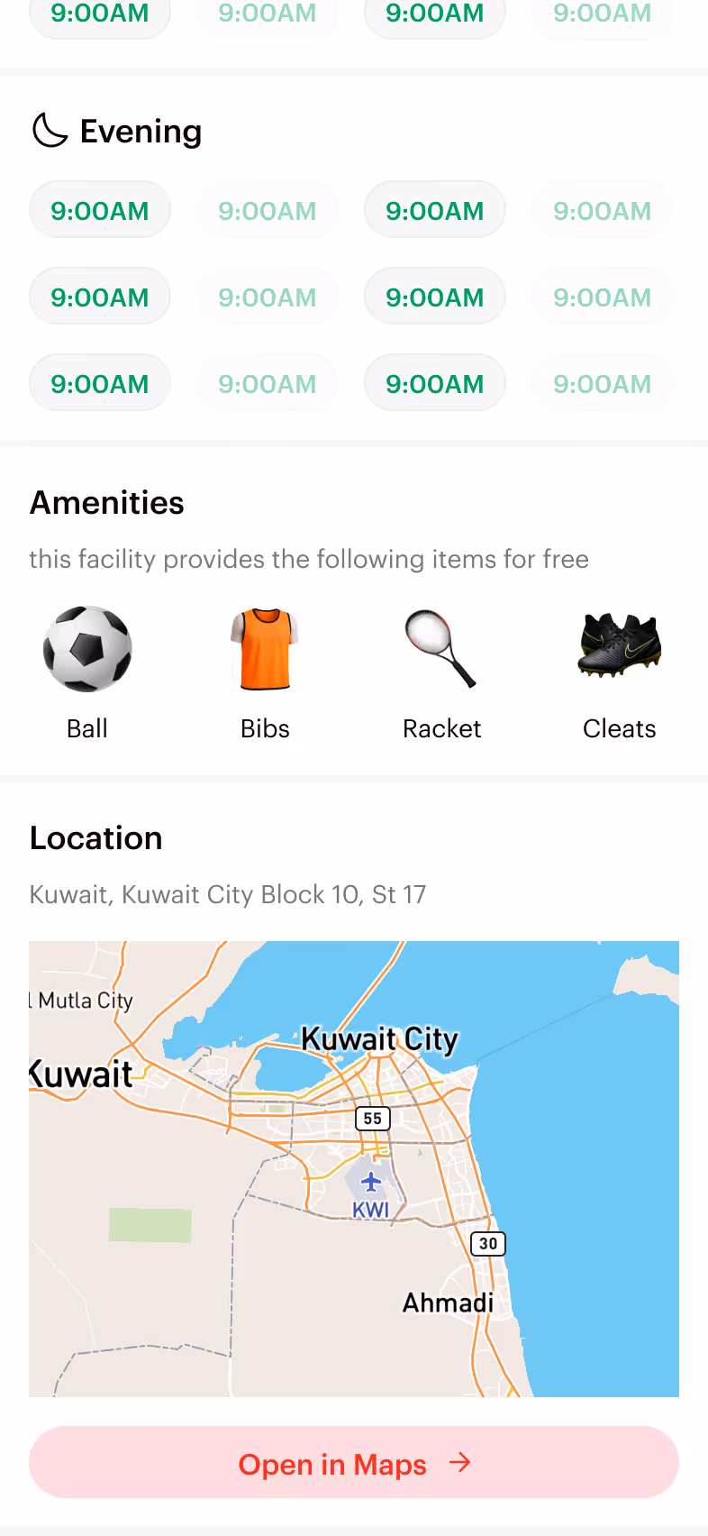
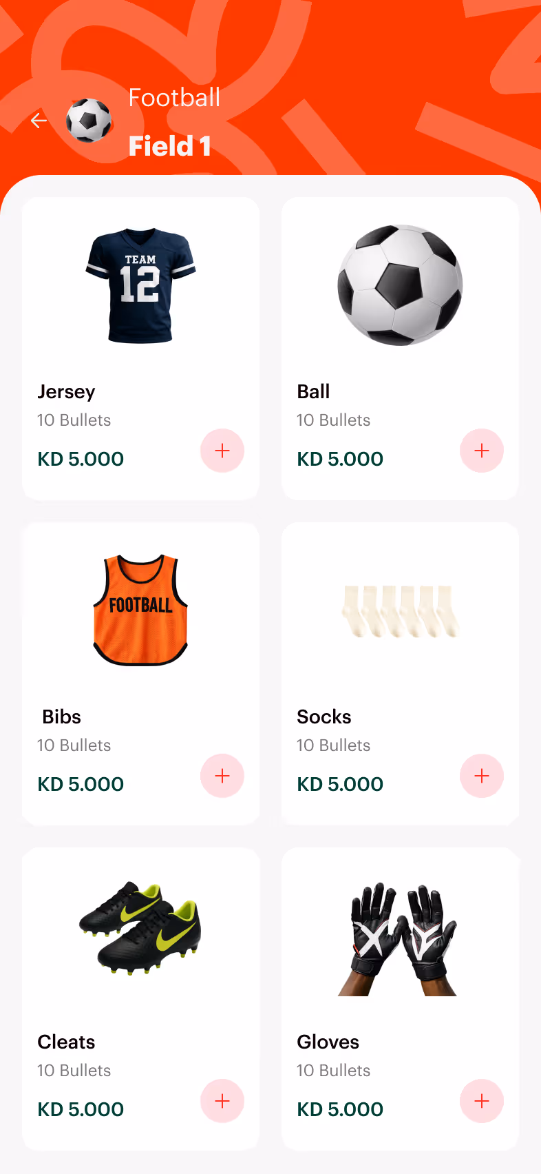
Key venue information such as size specifications, operating hours, and available time slots was presented in a visually cluttered layout, and inconsistently formatted across listings. Users found it difficult to compare options or understand what exactly was included in a booking.
Lengthy Checkout Process
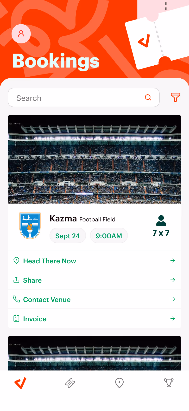
The booking and checkout process involved too many steps and lacked clarity, which caused friction at a critical conversion point.
PROCESS
Market Research
Wireframing
Pototyping
1
Market Research
Researched regional and international sports booking platforms to understand industry standards and user expectations.
2
Wireframing
Created low fidelity wireframes to map out key user flows, including venue discovery, filtering, and the checkout process.
3
Pototyping
Built interactive prototypes to simulate the booking experience. This was done to ensure usability and gather early feedback before development.
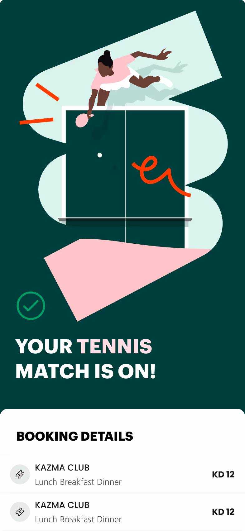
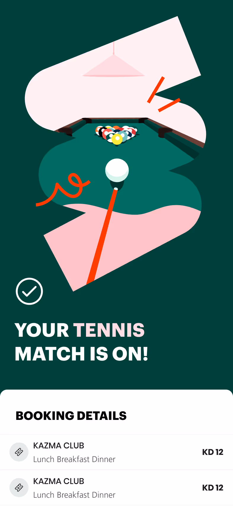
SOLUTIONS
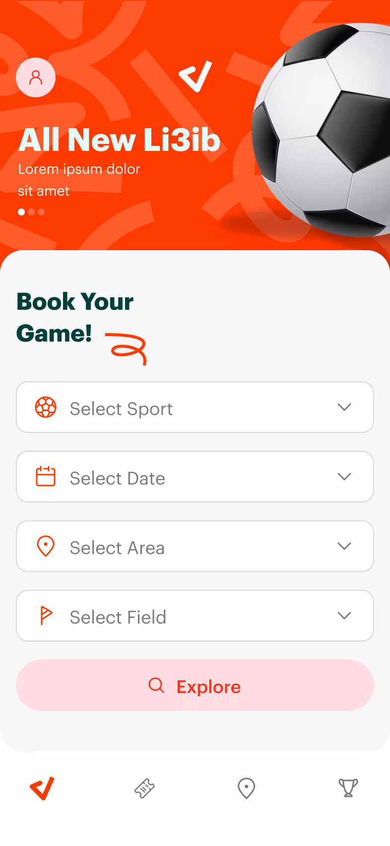
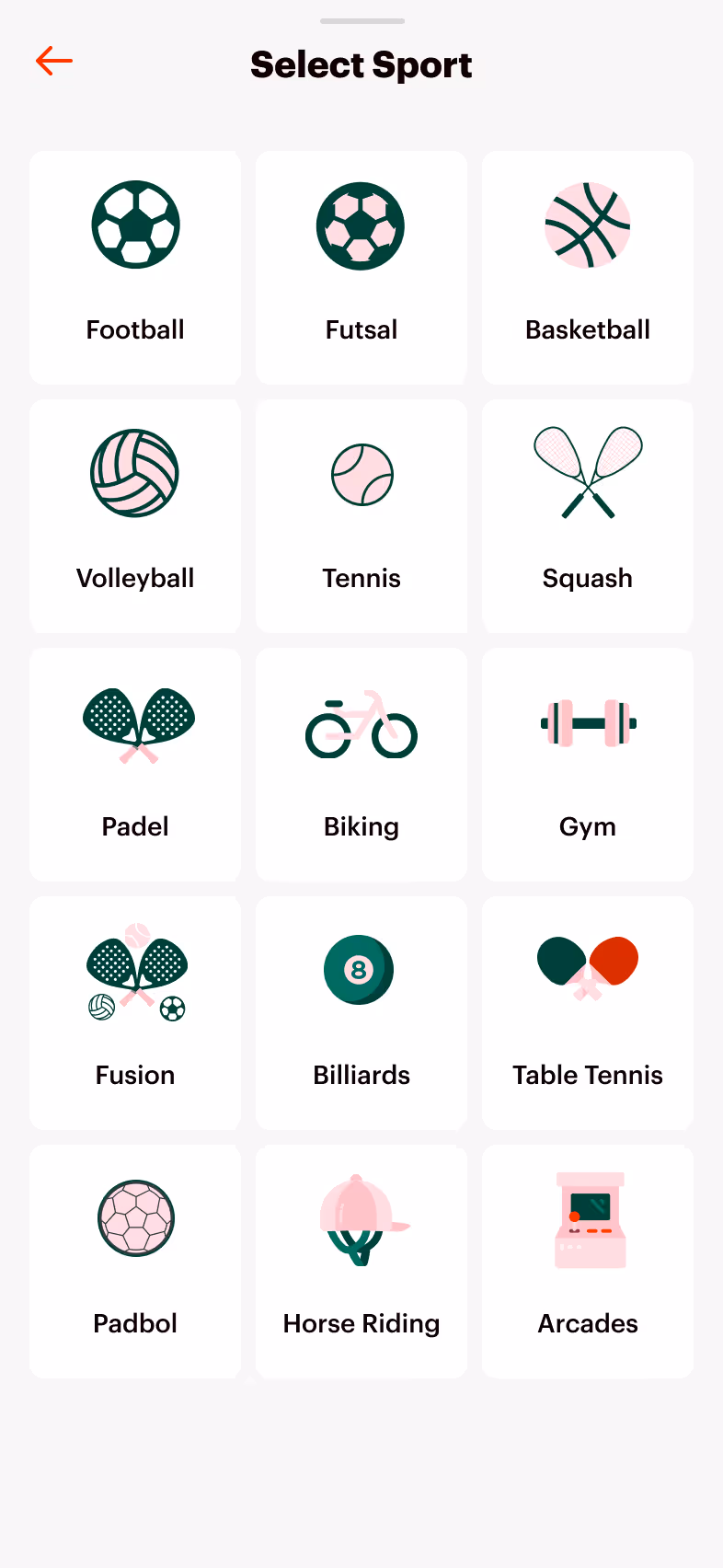
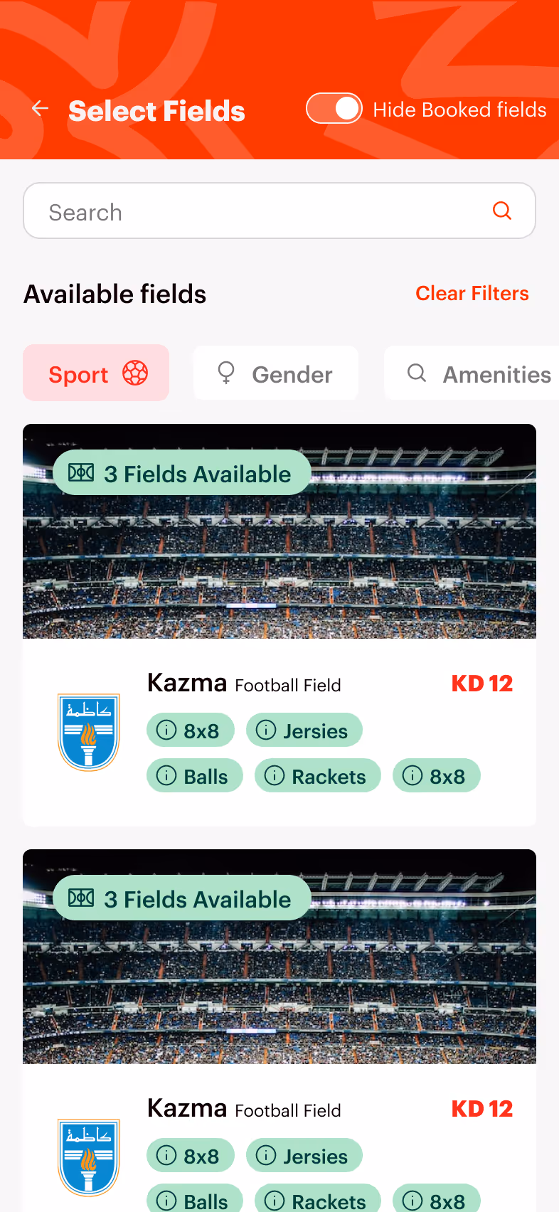
Improved Categorization and Navigation
Refined layout and Visual Hierarchy
Streamlined Checkout Process
Improved Categorization and Navigation
Clear categorization by sport type, location, and facility features was introduced to help users quickly narrow down relevant options. An optimized filter and search experience made it easier to browse venues reducing decision fatigue and streamlining the discovery process.
Refined layout and Visual Hierarchy
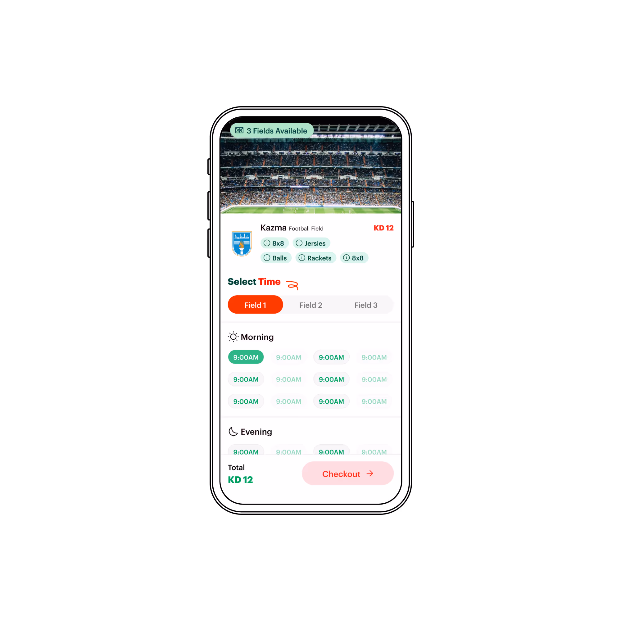
Venue details were reorganized using consistent formatting and a cleaner decluttered layout that prioritized key information such as field size, availability, and pricing. A clear visual hierarchy was achieved through thoughtful use of illustrative iconography.
Streamlined Checkout Process
Redundant steps were removed from the checkout process and progress indicators were introduced to provide feedback and guide users through each stage, ultimately reducing drop-off rates.